Polarization between Republicans and Democrats in America is exceptionally high, impacting virtually everything about how members of the two parties relate to each other. Affective polarization is one form of political intolerance that has been studied extensively by other academics. The 2019 Atlantic story on The Geography of Partisan Prejudice, which employed data analytics from the group PredictWise, shows where this intolerance is most prevalent in America.
We wanted to delve further into this and other data to determine why the most politically tolerant counties are so unique, and what we could learn from them. Therefore, we used these rankings of political tolerance to mine the differences between the top 1% and bottom 1% of counties.
The Data
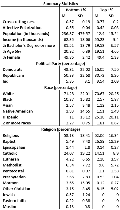
We combined data from multiple sources using FIPS county codes. First, we used the 2019 map of political tolerance to identify the 1% of the most and least politically tolerant countries. Predictwise, the team who modelled and ranked the counties on political tolerance, also provided us with data on affective polarization and cross-cuttingness at the block level. To aggregate their numbers to the county level, we weighted averages by their population. Here, cross-cuttingness is measured as how balanced the numbers of Democrats and Republicans are at the neighborhood level. Affective polarization is an assessment of how positively or negatively one views political groups (e.g. “How would you react if a member of your immediate family married a Democrat?”). We added demographic information (race, gender, age, median household income) from the 2019 U.S. Census data at the county level. Finally, we added in data on religiosity and religion from a real estate site, as well as data on hate crimes committed in 2020 from the US Crisis Monitor.
The Analysis
We were mainly interested in comparing the top 1% (N=21) and bottom 1% (N=30) counties in terms of the factors associated with political tolerance.
T-tests showed that the most politically tolerant counties (M=0.77, SD = .19) had higher levels of cross cutting-ness than the least tolerant counties (M=0.57, SD = .20) (t(42.414) = -3.70, p<.001). Meanwhile, the least politically tolerant counties (M=0.65, SD = .04) were more affectively polarized than the most tolerant counties (M=0.42, SD = .03) (t(49) = 21.84, p<.001).
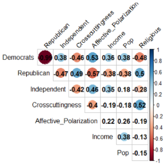
Additionally, we ran Pearson’s R correlations. Counties with more democrats and independents had lower cross cutting-ness and were more affectively polarized, while the opposite was found for Republicans. Furthermore, we explored whether the correlations among our variables of interest differed between the most and least politically tolerant counties.
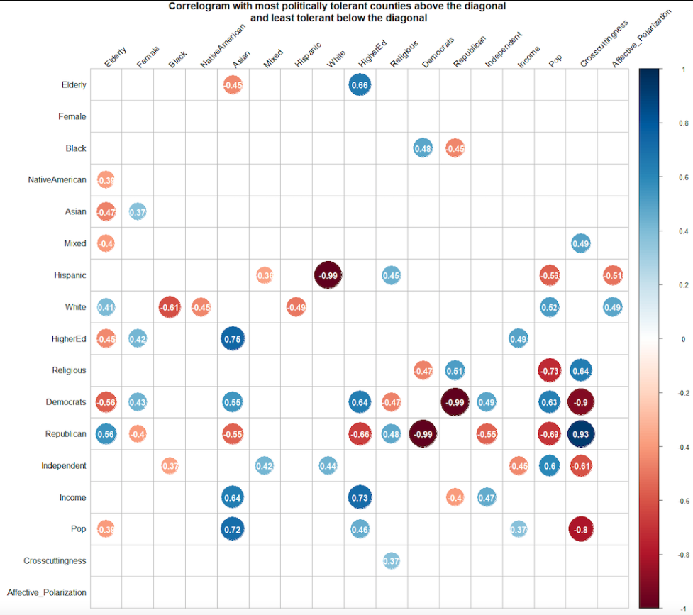
We further mined the data by comparing means on the remaining variables to explore what other differences may lie between the most and least politically tolerant counties.